Page 1 of 2
Give us a graphic
Posted: 15:44 Thu 21 Jun 2007
by KillerB
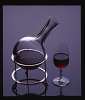
The title graphic on here is a default one. Obviously it says nothing about Port so it's time to start looking around. Can't use a bottle on its side, it's been done. Wide-angle picture of the Douro Valley - maybe. Row of Port bottles or full glasses?
See what you've got. The winner will get the prize of seeing their submission every time they sign on.
De-stickied by admin 6/7/7
Posted: 16:05 Thu 21 Jun 2007
by Conky
This is a photo of my favourite bottle of Port. (Its not really, haven't really got a clue what it is).
And although not suitable for the site graphic, I thought it might get you in the mood.
Please concentrate on the bottle....
 {Picture of woman in low-cut dress removed because JDAW is at work, this should help explain some of the later comments - changed by admin 21/07/2007}
Alan
{Picture of woman in low-cut dress removed because JDAW is at work, this should help explain some of the later comments - changed by admin 21/07/2007}
Alan
a bottle might not look like ‘work’
Posted: 16:43 Thu 21 Jun 2007
by jdaw1
My preference would be nothing. Don’t waste the space. And, for those logged on from work, a bottle might not look like ‘work’.
Posted: 16:48 Thu 21 Jun 2007
by KillerB
Space is already taken up by the big @ graphic, so something more appropriate does make sense.
Re: a bottle might not look like ‘work’
Posted: 16:52 Thu 21 Jun 2007
by DRT
jdaw1 wrote:for those logged on from work, a bottle might not look like ‘work’.
Agreed - I can supply a wide graphic with the words UK Pensions Forum in bold type - not sure if this would help everyone else but it would certainly help me when I'm in the office

Derek
Each to his own alibi
Posted: 16:57 Thu 21 Jun 2007
by jdaw1
Fantastic idea! Can we each supply our own? Bottled gases, Uruguayan bonds, Pension reform — each to his own alibi.
Posted: 17:17 Thu 21 Jun 2007
by DRT
KillerB,
When does Webmistress Treacle get home? We need urgent assistance to set-up user defined banners with a panic button that turns the whole screen into a spreadsheet with one click 8) (OK, so I copied that idea from somewhere else

)
Derek
Posted: 17:18 Thu 21 Jun 2007
by KillerB
So all we've got so far is a pair of boobs, is it?
Posted: 17:22 Thu 21 Jun 2007
by Conky
Posted: 17:38 Thu 21 Jun 2007
by KillerB
I wasn't thinking of me.
Posted: 18:44 Thu 21 Jun 2007
by Conky
KillerB (Alex)
Julian has made the point that my photo may cause him problems viewing the site whilst at work. I thought it was pretty tame, but fairs fair, I'm happy to delete it, it was only a bit of juvenile humour. Of course that would make some of the following posts seem odd. Could you have a look and delete what will cheer Julian up but leaves all the graphics conversation intact.
I cant say I wont get up to mischief in the future, but with such a great Forum and promising start, I'm in a very comprimising mood.
Over to you bud.
Alan
Posted: 18:52 Thu 21 Jun 2007
by KillerB
Done - now that's forum moderation, isn't it?
Square parentheses
Posted: 19:01 Thu 21 Jun 2007
by jdaw1
Or, when deleting one's own stuff, replace it with something like “[Mildly raunchy picture deleted on the suggestion of …]†. And perhaps leave in a link to the picture.
And, to be emphatic, there’s nothing wrong with mischief.

Back to the main point: when I said
jdaw1 wrote:My preference would be nothing. Don’t waste the space.
what I meant was not the current “@† picture, what I meant was no picture at all.
Posted: 20:27 Thu 21 Jun 2007
by Treacle
Derek T. wrote:KillerB,
When does Webmistress Treacle get home? We need urgent assistance to set-up user defined banners with a panic button that turns the whole screen into a spreadsheet with one click 8) (OK, so I copied that idea from somewhere else
)
Derek
Hiya Derek
I have seen that facility on other sites. I think I can create a spreadsheet and then link a button through. I assume it should go near the top somewhere.
Are people happy with the colour scheme - not very "port-like" but quite clean
Treacle
Clean, simple, easy to read, high-contrast: fantastic.
Posted: 20:52 Thu 21 Jun 2007
by jdaw1
Clean, simple, easy to read, high-contrast: fantastic.
Graphic designer gone mad and a pestilence on the users who we hate anyway: bad.
Posted: 21:34 Thu 21 Jun 2007
by DRT
Treacle,
The colour scheme does me fine, thanks.
The panic button was a joke but woul be cool to have if you want to make it happen.
The bottles of cloudy bay we owe you are adding up quick! And I suppose we could get Alex a cruz tawny !
Posted: 09:52 Fri 22 Jun 2007
by RonnieRoots
Is there a fixed size to the graphic?
Posted: 10:13 Fri 22 Jun 2007
by KillerB
RonnieRoots wrote:Is there a fixed size to the graphic?
See that big blue strip at the top with "The Port Forum.com" - it's got to go in there. Doesn't have to be full width, but that's the height. Could be several of course.
Posted: 10:47 Fri 22 Jun 2007
by RonnieRoots
Posted: 10:59 Fri 22 Jun 2007
by KillerB
That's the sort of thing - excellent.
Posted: 12:04 Fri 22 Jun 2007
by Conky
Although the classic view may be the way to go,
something about what Jdaw1 said appealed to my sense of style.
I'll throw this one in as a small picture that would take the place of the @ on the top banner. I think the colours complement, and then I'd leave it alone as a modern,stylish banner for our site.
Feel free to laugh out loud!
Posted: 12:10 Fri 22 Jun 2007
by KillerB
That is also good, it could take over from the @.
Posted: 01:16 Sat 23 Jun 2007
by Treacle
I like the last of the Ronnie Roots images and have colourised it a bit.
Posted: 01:17 Sat 23 Jun 2007
by KillerB
I like that.
Posted: 01:22 Sat 23 Jun 2007
by DRT
I like that too - I' would suggest you just stick it in there and see what people think
Derek


