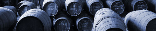
The title graphic on here is a default one. Obviously it says nothing about Port so it's time to start looking around. Can't use a bottle on its side, it's been done. Wide-angle picture of the Douro Valley - maybe. Row of Port bottles or full glasses?
See what you've got. The winner will get the prize of seeing their submission every time they sign on.
De-stickied by admin 6/7/7
Give us a graphic
-
KillerB

- Taylor Quinta de Vargellas 1987
- Posts: 2425
- Joined: 22:09 Wed 20 Jun 2007
- Location: Sky Blue City, England
Give us a graphic
Last edited by KillerB on 22:33 Fri 06 Jul 2007, edited 1 time in total.
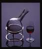
This is a photo of my favourite bottle of Port. (Its not really, haven't really got a clue what it is).
And although not suitable for the site graphic, I thought it might get you in the mood.
Please concentrate on the bottle....
{Picture of woman in low-cut dress removed because JDAW is at work, this should help explain some of the later comments - changed by admin 21/07/2007}
Alan
And although not suitable for the site graphic, I thought it might get you in the mood.
Please concentrate on the bottle....
{Picture of woman in low-cut dress removed because JDAW is at work, this should help explain some of the later comments - changed by admin 21/07/2007}
Alan

a bottle might not look like ‘work’
My preference would be nothing. Don’t waste the space. And, for those logged on from work, a bottle might not look like ‘work’.

Re: a bottle might not look like ‘work’
Agreed - I can supply a wide graphic with the words UK Pensions Forum in bold type - not sure if this would help everyone else but it would certainly help me when I'm in the officejdaw1 wrote:for those logged on from work, a bottle might not look like ‘work’.
Derek
Each to his own alibi
Fantastic idea! Can we each supply our own? Bottled gases, Uruguayan bonds, Pension reform — each to his own alibi.
KillerB (Alex)
Julian has made the point that my photo may cause him problems viewing the site whilst at work. I thought it was pretty tame, but fairs fair, I'm happy to delete it, it was only a bit of juvenile humour. Of course that would make some of the following posts seem odd. Could you have a look and delete what will cheer Julian up but leaves all the graphics conversation intact.
I cant say I wont get up to mischief in the future, but with such a great Forum and promising start, I'm in a very comprimising mood.
Over to you bud.
Alan
Square parentheses
Or, when deleting one's own stuff, replace it with something like “[Mildly raunchy picture deleted on the suggestion of …]†. And perhaps leave in a link to the picture.
And, to be emphatic, there’s nothing wrong with mischief.
Back to the main point: when I said
And, to be emphatic, there’s nothing wrong with mischief.
Back to the main point: when I said
what I meant was not the current “@† picture, what I meant was no picture at all.jdaw1 wrote:My preference would be nothing. Don’t waste the space.

Hiya DerekDerek T. wrote:KillerB,
When does Webmistress Treacle get home? We need urgent assistance to set-up user defined banners with a panic button that turns the whole screen into a spreadsheet with one click 8) (OK, so I copied that idea from somewhere else)
Derek
I have seen that facility on other sites. I think I can create a spreadsheet and then link a button through. I assume it should go near the top somewhere.
Are people happy with the colour scheme - not very "port-like" but quite clean
Treacle
Clean, simple, easy to read, high-contrast: fantastic.
Clean, simple, easy to read, high-contrast: fantastic.
Graphic designer gone mad and a pestilence on the users who we hate anyway: bad.
Graphic designer gone mad and a pestilence on the users who we hate anyway: bad.
-
RonnieRoots
- Fonseca 1980
- Posts: 1981
- Joined: 08:28 Thu 21 Jun 2007
- Location: Middle Earth
-
RonnieRoots
- Fonseca 1980
- Posts: 1981
- Joined: 08:28 Thu 21 Jun 2007
- Location: Middle Earth


Although the classic view may be the way to go,
something about what Jdaw1 said appealed to my sense of style.
I'll throw this one in as a small picture that would take the place of the @ on the top banner. I think the colours complement, and then I'd leave it alone as a modern,stylish banner for our site.
Feel free to laugh out loud!
something about what Jdaw1 said appealed to my sense of style.
I'll throw this one in as a small picture that would take the place of the @ on the top banner. I think the colours complement, and then I'd leave it alone as a modern,stylish banner for our site.
Feel free to laugh out loud!