I Hate Modern Labels
When I was lining up the bottles for the picture below I thought it was a magnificant example of why the port trade should have resisted the temptation to go for fancy labels designed by some spotty kid straight out of art school. Just look at how soulless those three bottles to the far right look when compared with the character and magnificance of their companions (apart from the imposter label of the far left which was produced by me in a moment of weakness )
Bring back black labels with big white block fonts - wonderful
Derek
Bring back black labels with big white block fonts - wonderful
Derek
"The first duty of Port is to be red"
Ernest H. Cockburn
Ernest H. Cockburn
- uncle tom
- Dalva Golden White Colheita 1952
- Posts: 3520
- Joined: 23:43 Wed 20 Jun 2007
- Location: Near Saffron Walden, England
I wonder who put those neck tags on some of the bottles...
In a rare moment of sanity, Greene King have started using unglazed lables, (with a traditional design) for their Light Ale bottles.
The result does not look ersatz, tacky or contrived - just a sound everyday label, that looks the part.
I'm easy about VP producers using glazed or unglazed lables - each to his own - but the paint splash is becoming a bit silly..
I don't know of any producer who takes care to make sure the bottles are laid the correct way up when they put them into wooden cases - so they presumably consider that it does not make a jot of difference which way round they are cellared.
For the last 30 years, bottle makers have put a locating indent on the back of bottles (in the glass), to enable (I believe) the labelling plant to get the back label exactly opposite the front one.
They were not always used in the early days, so some bottlings of the 77's and 80's have the locating indent on the front, side, or wherever!
But in modern bottlings the position is consistantly at the back - so if the paint splash really did achieve anything...
..it is now redundant!
Tom
I may be drunk, Miss, but in the morning I shall be sober and you will still be ugly - W.S. Churchill
consistent labels
I want consistent labels. Even if I prefer the bolder cleaner pre-1985 version, now it’s the 1985-2000 version, please don’t change it for half a century or more.
Yes, “full of†. But not wrapped in.
- StevieCage
- Fonseca LBV
- Posts: 107
- Joined: 21:52 Thu 21 Jun 2007
- Location: Amsterdam, The Netherlands
In reality, we cant go completely back to those charming botles of the 40's and 50's.
Modern life requires Bar Codes and warnings, (Like that Sulphate one for the US?). What I would like to see, is that all the legal stuff is on a small label on the back. Then in keeping with tradition, I would like the unkempt white paint stencilling on the front. That would be limited to Company & year, no secondary years etc. Then, even if its of no use at all, the paint dot splashed on the front. Get rid of the IVDP label, and go back to a wax seal over the cork.
This would be impracticle for mass produced Port, but add to the character and experience of the best Ports. I would say the IVDP should only issue that status to the best VP's (Generally accepted to be God's work), but knowing them, and a few of you, if it ever happened, someone would demand it for the Human Blenders mix as well.
Alan
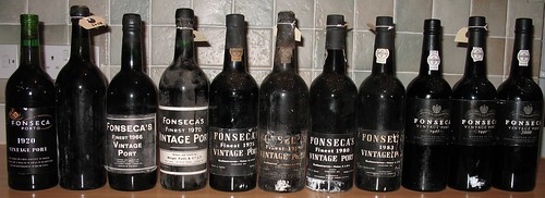
For the record, I also hate white painted stenciling on bottles - it makes them all look Portugues - Give me good old British VP with a dull label and a white splash of paint any day of the week. Next you'll be telling me King George is dead and we are planning to give up the ColoniesConky wrote: ...in keeping with tradition, I would like the unkempt white paint stencilling on the front.
As for the seal. I like it, and I want it to remain under the wax or [poisonous] lead seal. This only need apply to VP. Inferior styles need not comply with this. IVDP label incorporated into the back label would do the trick and plastic or foil capsules would suffice.
Derek
"The first duty of Port is to be red"
Ernest H. Cockburn
Ernest H. Cockburn
Tom,
You have seen the light! Although, my OCD does not allow me to have unlabelled bottles in my cellar so I create them in the old black and white style (like the Warre's 66 that turned out to be a Croft 55 at the Crusting Pipe).
Apart from that you are absolutely right.
As hard as I try I cannot become emotionally attached to modern looking bottles. Old distinguished ones are easy to love, the new ones just don't do it for me.
Conky, you know I'm right - just look at the picture again and try to imaging how dull it would be if the old ones were not there
Derek
"The first duty of Port is to be red"
Ernest H. Cockburn
Ernest H. Cockburn
-
- Taylor’s LBV
- Posts: 152
- Joined: 14:19 Sun 14 Oct 2007
- Location: Bolton England
Oh Dear...Batten down the hatches, John's set him off again!Overtired and emotional wrote:The rot began (1983 I think) when they used back labels to tell you what to do with vintage port.
You might not realise the geeky nature of some of the folk on here, but to give you an insight...
One of them constructs shattered corks from favourite bottles, and keeps them in a basket by his fire!
One of our lot stands on the cliffs of Cambridge (Thats quite a geographical achievement) working out the potential rainfall in the Douro during Harvest time!
And the one you've just kicked off again, he designs his own labels, and prints and glues them on certain dodgey bottles. Thats just to make the bottles feel part of the collective!
I'll get my white coat and the methadone!
Alan
John,
Welcome to my world.
You are spot on with the back label comment. These could be the root of all evil, but the real vilain is the glossy label designed by some marketing git with no taste.
Conky, wind it in, you are outnumbered by people with taste on this one
...but I agree that Tom and AHB are a bit weird
"The first duty of Port is to be red"
Ernest H. Cockburn
Ernest H. Cockburn
-
- Quinta do Vesuvio 1994
- Posts: 3032
- Joined: 22:16 Mon 25 Jun 2007
- Location: Los Angeles, Ca USA
- Contact:
-
- Quinta do Vesuvio 1994
- Posts: 3032
- Joined: 22:16 Mon 25 Jun 2007
- Location: Los Angeles, Ca USA
- Contact:
-
- Taylor’s LBV
- Posts: 152
- Joined: 14:19 Sun 14 Oct 2007
- Location: Bolton England
- RonnieRoots
- Fonseca 1980
- Posts: 1981
- Joined: 08:28 Thu 21 Jun 2007
- Location: Middle Earth
- Alex Bridgeman
- Graham’s 1948
- Posts: 14912
- Joined: 13:41 Mon 25 Jun 2007
- Location: Berkshire, UK
Derek and I have just shared a 1983 and it had no back label (apart from the one that I put on it).
And who else reconstructs corks? Conky can't have been referring to me as my basket of reconstructed corks is now on top of the bookcase and no longer next to the fire!
Alex
And who else reconstructs corks? Conky can't have been referring to me as my basket of reconstructed corks is now on top of the bookcase and no longer next to the fire!
Alex
Last edited by Alex Bridgeman on 14:07 Thu 25 Oct 2007, edited 1 time in total.
Top Ports in 2023: Taylor 1896 Colheita, b. 2021. A perfect Port.
2024: Niepoort 1900 Colheita, b.1971. A near perfect Port.
That is a very high standard of weirdness.
Only those two? That is a very high standard of weirdness.Derek T. wrote:I agree that Tom and AHB are a bit weird